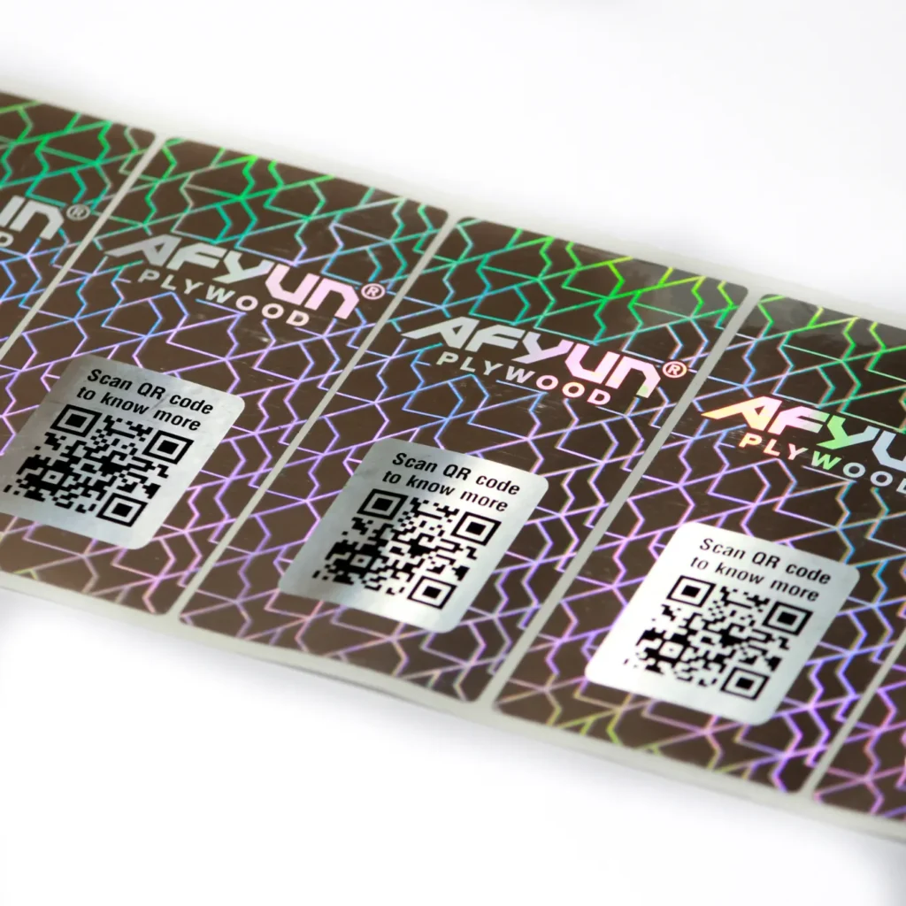
Color Psychology in Hologram Stickers: Make Your Brand Shine
Colors do more than make things seem good. They can change how others feel, help them trust you, and even make decisions. Businesses may make packaging hologram stickers that not only look good but also connect with customers if they know how color psychology works. Let’s look at how color selections affect holographic designs and which colors are appropriate for different types of businesses.

How to Pick the Best Color for Your Hologram Sticker
When choosing the proper color for your holographic sticker, think about how it fits with your product, your audience, and your brand message. Your target audience is very important. Bright, vivid colors of hologram stickers are frequently more appealing to younger people, while more traditional or muted hues may work well for older people.
The kind of merchandise also helps you make your choice. Cool colours like blue and silver work well for things that need to look serious or professional, while warm colours like red and orange work well for things that are more informal and everyday.
The Most Common Colours and What They Mean
1. Blue: Trust and professionalism
- Such color is best in the sectors of technology, health care, and finance.
- Helps people stay calm and take responsibility.
- Works excellently for marking safe products.
2. Red: Urgency and Passion
- Quickly gets people’s attention.
- A lot of the time, it’s used on sales tags and limited-edition labels.
- Makes you feel excited or important.
3. Gold and silver: wealth and status
- Perfect for high-end or gift items.
- Gives packing stickers a more elegant look.
- Ideal for makeup items, jewels, and high-end, fashionable items.
4. Green: Freshness and Nature
- A favorite color for organic and eco-friendly products.
- Means health, growth, and long-term success.
Why Color is Important in Hologram Design
Colors make people feel and think in ways that affect how they see a product. This effect gets even stronger when you use it in a hologram sticker design. A good color choice may quickly grab attention, show off your brand’s personality, and make people feel certain things, like trust, luxury, or enthusiasm.
Colors may also say things without using words. They help people connect with your product more quickly, often without them even knowing it. For example, blue might make you look professional, but red can make you feel like you need to act quickly. When making stickers for packaging, it’s important to know what kind of emotional tone you want to send and make sure it matches what your audience likes. When chosen carefully, color becomes an important part of building a brand.
Mixing colors with holographic effects
When light hits the holographic layer, it changes color. The correct foundation color with this effect can make things look even better. Smart combinations of design:
- Black with a rainbow effect—makes everything more dramatic and bold.
- A blue foundation with a silver holograph gives it a futuristic look.
- Light holographic shine on pastel colors gives a peaceful and elegant look.
Make sure your design doesn’t cover up crucial language or brand logos. It’s all about balance.
Conclusion
Color psychology is a very useful tool for making hologram stickers. When utilized correctly, it can change how customers see your brand, raise its value, and make it easier to see on store shelves. Your choice of color for packaging hologram stickers is like a silent brand ambassador; it talks about your brand even when people don’t touch or use it. Get stickers for your packaging that are made just for you and fit your brand’s personality. Get in touch with us today!
